

In the digital age where the average person interacts with their smartphone over 2,600 times a day, designing an intuitive user interface (UI) is more crucial than ever. The success of an app can hinge on the user's ease of use and overall experience, which is directly influenced by how accessible and user-friendly the UI is. This comprehensive guide provides a strategic approach to enhancing app usability through a data-driven UI design process.
Introduction to Screen Engagement Zones
When we look at a smartphone screen, not all areas are created equal. Certain regions naturally attract more activity based on how we hold and interact with our devices. Understanding these zones can significantly impact how we design our apps.
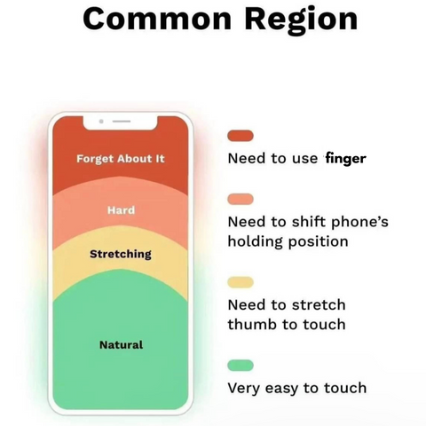
The 'Common Region' Framework
The 'Common Region' framework divides the smartphone screen into areas based on ease of reach and likelihood of interaction. These zones are:
- Natural: The thumb-friendly zone where most interactions should happen.
- Stretching: Requires some finger stretching, suitable for less critical functions.
- Hard: Less accessible without adjusting grip, use sparingly.
- Forget About It: Least interactive zone, avoid placing key features here.
This framework is not just theoretical; it's born out of empirical data collected from user interactions across numerous apps.
Importance of Data in UI Design
Before diving into the strategic implementation of features based on these zones, one must appreciate the importance of data in the design process. Every tap, swipe, and pinch is a data point that, when aggregated, tells a story of how users are interacting with your app.
Leveraging User Interaction Data
User interaction data allows designers to see which features are being used the most and how they are being accessed. This information is pivotal in understanding what to place in the 'Natural' zone, highlighted in the 'Most Important Elements' image above. It's about merging design with the natural user behavior pattern.
Feature Placement and User Engagement
The data collected from user interactions is the foundation for feature placement within these engagement zones. The goal is to make the app not only aesthetically pleasing but also functionally optimal.
Placing Less Critical Features

As seen in the 'Less Important Elements' graphic, not every feature demands prime real estate on the screen. Secondary functions can reside in the 'Stretching' zone, which the user can reach with a little effort, keeping the 'Natural' zone clutter-free for the most critical elements.
Optimizing the User Experience
Optimization is an ongoing process. Placing features is just the beginning. Continuous analysis and iteration are key to ensuring that the UI evolves with the users' needs.
When to Break the Rules
The 'Don't Care Elements' image serves as a reminder that sometimes, you may need to place an important feature outside the 'Natural' zone. When this is the case, it's crucial to implement additional gestures or interactions to make these features easily accessible, like the innovative solutions seen in popular social media apps.
Continual Improvement and Adaptation
The most effective UI designs are not set in stone; they adapt and evolve. Regular revisits to user interaction data, updating your understanding of engagement patterns, and adjusting the UI accordingly are all part of creating a successful app.
Analyzing and Iterating Based on User Data
To truly refine and optimize the user interface, one must adopt a cyclical process of analysis and iteration. This doesn't just mean making arbitrary changes based on gut feelings or trends; it means making informed decisions based on concrete user interaction data. But how do we quantify something as inherently subjective as user experience?
The answer lies in creating baselines for feature interaction and using tools that can measure user engagement accurately. One such indispensable tool in the UI/UX designer's arsenal is the heatmap.
Utilizing Heatmap Tools
Heatmap tools provide a visual representation of data, showcasing where users are clicking, tapping, or spending time on your app's interface. They can identify hotspots of activity and areas that are being ignored.
By applying a heatmap tool to each engagement zone, you can see exactly how users are interacting with your app's features. The 'Natural' zone might show a high concentration of taps, swipes, and engagement, which is expected. But what about the 'Stretching' or 'Hard' zones? Are users interacting with these areas as anticipated, or are they avoiding them altogether?
Creating Interaction Baselines
A baseline is essentially a standard or point of reference. In UI design, establishing a baseline means determining the average interaction level for a feature within a specific zone under normal conditions. This serves as a benchmark for measuring the impact of any changes you implement.
Once you've established these baselines using a heatmap tool, you can start experimenting. Move a feature from the 'Less Important Elements' zone to the 'Natural' zone and measure the change in heat. Does engagement increase? If not, why? Is there a drop in interaction with another feature as a result?
Iterative Design Based on Data
With the baselines set and the heatmap data in hand, the iterative design process becomes a series of calculated steps rather than random leaps. You implement a change, measure it against the baseline, and then decide whether to keep it, tweak it, or revert it. Each iteration is an opportunity to learn more about your users and to craft a UI that resonates with their preferences and behaviors.
By continually monitoring how these placements affect usability and comparing them against your baselines, you can iterate towards a more intuitive app design. This approach ensures that your UI is not only user-friendly but also dynamic, capable of evolving with the needs and habits of your users.
This guide has outlined a strategic approach to UI design that prioritizes user engagement data. By understanding the common regions of screen interaction and applying rigorous testing, designers can craft interfaces that are not just visually appealing but also optimized for functionality and user satisfaction.
Remember, an optimal UI design is achieved not through guesswork but through the meticulous application of user data to inform every decision.